

Back when our ancestors were drawing wishes and stories in caves until today, when we are producing animated and interactive images, thousands of years have passed. However, our need to share stories and drive actions remains intact.
Along its evolutionary path, our species developed a vision to move safely in space, secure food and reproduce. Eyesight today occupies about 30% of our brain and is one of the most important senses. The brain directly perceives visual messages, but since letters, numbers, and symbols are recent discoveries, our brain needs to "translate" them to understand them. Studies have shown that people interpret colours much better than numbers and letters [1].
In our time, with huge and complex datasets (Big Data), the use of colors, maps & graphs in their representation makes them more "natural" for our brains and achieves the communication of information in a clear, universal, fast, and efficient way. At the same time, it facilitates the identification of trends, patterns or extreme values and equips decision-makers with a valuable tool for understanding reality and taking initiative.
The History of Visualizations
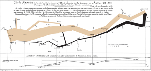
Humans realized early the importance of images in understanding data, supporting hypotheses, and disseminating messages. As the scientific revolution blossomed and data became available, the use of graphs grew and expanded. Prominent among the pioneers of information graphics is Charles Joseph Minard. In 1869, he had the idea to map Napoleon's campaign in Russia. The size of the army, the direction, the time, the stations and the temperatures encountered by the emperor were masterfully depicted on the map to give a complete view of the event and gave the map a prominent place in the history of charts.
Nowadays, the development of computers has made it possible to process and represent huge amounts of data at lightning speed. Artificial intelligence has changed the game. Now, machines automatically collect data and transform it into images. One example is creating images from text. According to Gartner, by 2025 75% of graphs will be generated by automated systems.
Tables & Reports or Figures
Using tables, spreadsheets and reports often gives the impression of solid and irreplaceable constructs, ideal for reporting results and disseminating information. But the mind does not have the same opinion.
"Aoccdrnig to a rscheearch at Cmabrigde Uinervtisy, it deosn't mttaer in waht oredr the ltteers in a wrod are, the olny iprmoetnt tihng is taht the frist and lsat ltteer be at the rghit pclae. The rset can be a toatl mses and you can sitll raed it wouthit porbelm. Tihs is bcuseae the huamn mnid deos not raed ervey lteter by istlef, but the wrod as a wlohe."
The reason why many people find it difficult to manage numbers is related to those mentioned above. Despite its evolution, the human brain retains an animal organ at its core and is prone to instinctive responses. Using graphs to visualize massive & complex data is easier than digging through spreadsheets or reports because it taps into people's intuition. It helps users to immediately perceive key figures and focus their attention on areas of significant importance. In this way, they can build on analytics. However, it is better to start with general pictures and key performance indicators (KPIs) if we want to be effective.
Trust your Partners
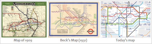
When Harry Beck presented a new map for the London Underground in 1931, it was considered too radical and was rejected. Two years later, the public had enthusiastically adopted it. What was considered radical in Beck's map? The transfer of interest from data to information. Until then, public vehicle traffic maps attempted to map routes and stations based on geography with relative accuracy. As of now, however, the passengers were interested in something other than the roads above the wires but how they would reach their destination and where they should board. That's exactly what Beck's map helped with, and that's why it's survived to this day with minor variations: It was helpful because it focused on the message, not the record.
The public embrace with unexpected natural innovations that bring them closer to their desires. The experience of social networks, mobile phones, remote communication, and many others illuminate aspects of everyday life that citizens preceded businesses. Employees were ready to adopt remote work because they already used these technologies as citizens. A similar readiness exists for the use of operational and scientific data. As information, collaboration and change have emerged as structural elements of modern organizations, the direct transfer of messages to all levels of the hierarchy and the decentralization of decisions is a one-way street. Businesses that have invested in democratizing their data outperform the competition significantly. All of this requires the use of modern technologies for collecting, processing, and displaying data in formats that a high percentage of workers can immediately absorb. The widespread use of graphics from print and electronic media, combined with the improvement of digital literacy offer fertile ground for the emergence of talented workers, who will fuel with action the unprecedented cycles of innovation to meet the needs of the business. Digital transformation cannot proceed at the behest of the administration. It will proceed with the will and initiative of the workers and the effective dissemination of information is necessary on this path.
Consult the experts
One does not need to know the laws of optics to see an object. However, knowing the rules of optics helps to make better use of vision and prevents accidents. Data visualization has evolved into a rapidly growing blend of science and art, unlocking new possibilities for companies and society. We need to invest in specialized teams with special knowledge and skills to enjoy its fruits.
Before we visualize the data, it is necessary to clarify the goal of our work.
- Consider the actions that we want to support through data,
- Choose the architecture of the solution,
- Take care of the availability, integrity and update of the data,
- Design the end user's environment (UI - User Interface) to ensure the best experience (UX - User Experience) and efficiency.
To achieve our goal, the deliverable must:
- Present data clearly and coherently, regardless of its volume and complexity,
- Encourage the viewer to focus on the bottom line rather than the graphs themselves,
- Encourage the eyes to compare different datasets,
- Reveal similarities, differences or trends and simplify decision-making,
- Facilitates the journey of thought from the general to the specific, detecting details and discovering hidden secrets,
- Help communicate and align organizational goals by crafting stories,
- Harmoniously integrated into the responsibilities and responsibilities of the users
Dare to dream!
The convergence of the analog with the digital world is drastically changing the business and human environment. It is still too early to imagine the world that will emerge but we know that the winners will be those who get on the bandwagon of the digital age first, and the safest way to do this is to utilize corporate data.
Today, where information has emerged as a critical asset of organizations, the road map for fulfilling business ambitions passes through the data strategy. Visualization is the easiest way to start.
Do not wait:
1. Create a vision and strategy that touches employees
2. Define the operating framework & set the governance rules
3. Identify your data champions
4. Start with small steps from the most mature parts of the business
5. Create success stories that will travel throughout the organization
6. Establish feedback mechanisms for knowledge integration
7. Refine your design and move on
Let's do this!
Shape data management policy and empower employees to transform businesses and improve the world.
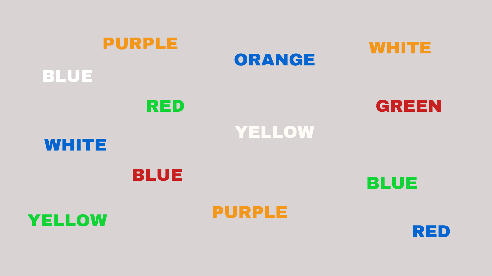
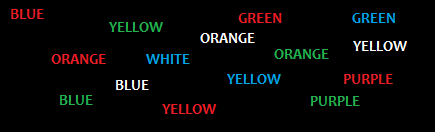
An easy way to realize the way that our brain works, is to look at the words below and read their colors, not the words themselves:
Christos Papadopoulos
At WITSIDE, we specialize in data management and analysis. Data visualization is at the core of our activity. We are at your disposal to consider your way of utilizing the data. ask@witside.com